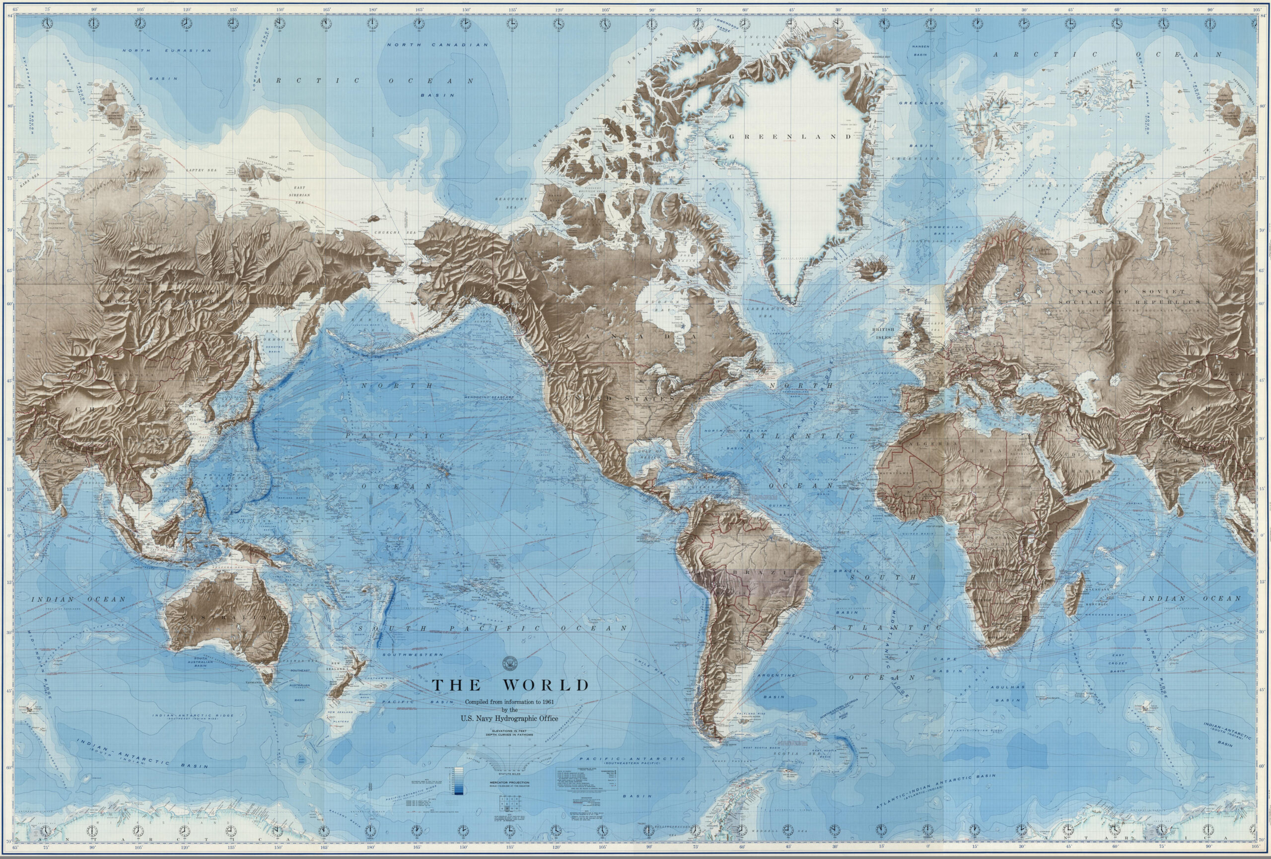
It’s not often that a map projection makes headlines. I have tried and failed to convince editors they are newsworthy. So it’s honestly exciting to see so many stories about the United Nations’ decision to adopt a new map projection. When I heard the news, I thought, “YES! They are ditching the Mercator. Good riddance!” I was pretty sure I knew why.
To understand this decision, it helps to know a little about map projections. Because the Earth is a three-dimensional, round object, all maps have to distort geography in some way to fit that information onto a two-dimensional piece of paper (or your computer screen). Think of cutting open a tennis ball and trying to lay it flat on a table. There are five different aspects of geography that can be distorted to varying degrees during the flattening process: area, shape, distance, direction, and angle. Reducing the distortion of one of these attributes necessarily means increasing the distortion of one or more of the others. A map projection is basically math that dictates how things are distorted. Cartographers choose projections based on the purpose of a map.
(More on map projections—including my favorite, the Armadillo — and how they work in an excerpt from my book All Over the Map below),
The Mercator projection was designed for navigating oceans, so it prioritizes keeping angles and directions between two locations true. To make up for that, it distorts the size and shape of landmasses, making some places (notably Africa) look smaller relative to other continents, and it inflates the size of others (notably Europe and North America). People have argued that this also inflates the perceived importance of northern hemisphere countries relative to countries closer to the equator, which is what I suspected was the reason the U.N. ditched the projection.
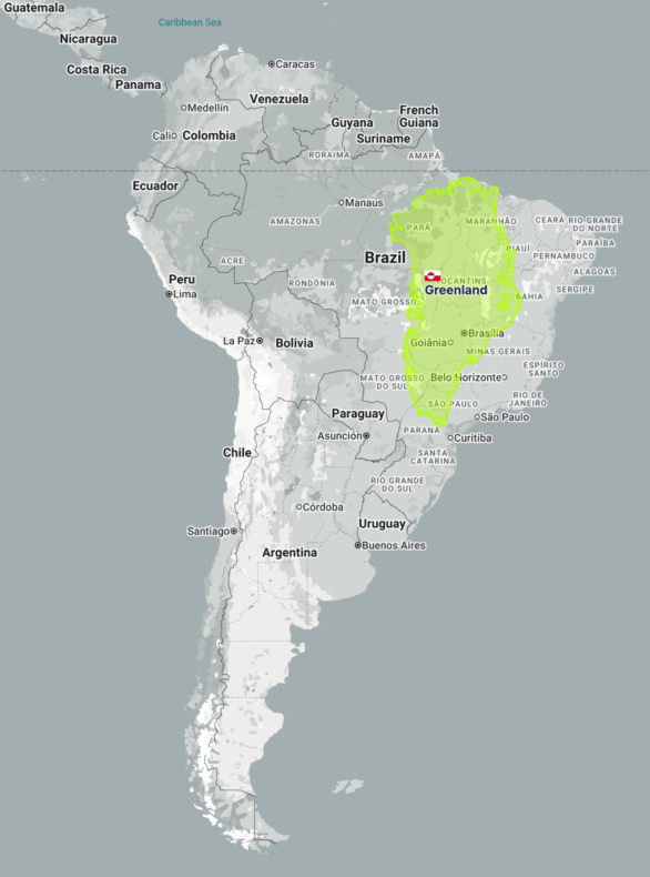
To see how absurd the Mercator projection’s distortions are, visit thetruesize.com where you can see that Brazil is essentially the same size as the entire continental U.S., and also the same size as Canada! Alaska is smaller than Libya. And yes, Greenland is not larger than South America (as it appears to be in the Mercator map at the top of the post). In fact, it is only a quarter of the size of Brazil alone. (You can read more about how your mental map of the world is probably wrong in this story I wrote for National Geographic).
But my glee at hearing the news was immediately followed by dread. If you want the size of the landmasses to be relatively undistorted, but you still want a rectangular map that fits nicely onto a square piece of paper, the solution is even worse than the problem: the hideous Gall-Peters projection, which, as many cartographers have pointed out, makes the continents look like wet laundry hanging from a clothesline (see the first map in the excerpt below).
Thankfully, the U.N.was willing to forgo the square in favor of a much more attractive choice: the Equal Earth Projection. This is a fairly new option, having only been invented by a trio of cartographers in 2018.
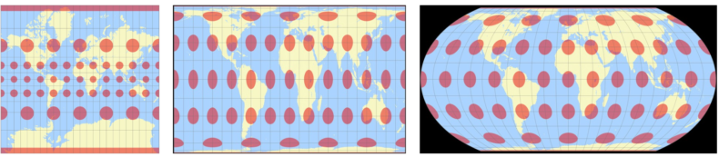
Another handy way to visualize the distortions of a map projection is Tissot’s indicatrix, which plots circles on the map that are stretched the way the underlying geography is. Here are the indicatraces for Mercator, Gall-Peters, and Equal Earth projections.
The following is an excerpt from my book with Greg Miller, All Over the Map: A Cartographic Odyssey (National Geographic, 2018).
Flattening the World
The problem of reducing the globe to two dimensions has many interesting solutions
Every cartographer creating a map of the world faces the same problem: how to flatten the skin of a three-dimensional sphere onto a two-dimensional plane. There’s simply no way to do it without stretching, tearing, or otherwise distorting the planet’s surface. Unless it’s on a globe, every map is an imperfect representation of reality in one way or another.
Different ways of representing Earth’s curved surface on a flat map are called projections. To choose one, cartographers have to decide which types of distortion they can live with and which to minimize. Projections can distort five aspects of geography: area, shape, distance, angle, and direction. Reducing one means increasing others.
One of the best known world map projections was designed in the 16th century by German-Flemish cartographer Gerard Mercator as a framework for maritime navigation. Maps that use his projection prioritize angles and direction so that if you were to draw a straight line between two points, you could measure the angle of the line with a protractor and use that bearing to travel between those points in the real world. Mercator’s projection remained popular into the 20th century, hanging on walls in many classrooms and, some would argue, distorting students’ conception of the world. It was particularly ubiquitous for maps focused on the oceans. The U.S. Navy Hydrographic Office adopted it (top of the post) and eventually pressured the U.S. Coast and Geodetic Survey into using it as well.
The Mercator projection began to fall out of favor in the middle of the 20th century largely due to one of its other notable characteristics: In order to keep direction true, lines of longitude have to be parallel, which means area is increasingly inflated toward the poles. This leads to gross distortions of the relative size of continents and countries, with some absurd results. For example, Sweden appears to be twice its actual size. Europe is also larger than it should be, which was handy for cartographers trying to fit in all of Europe’s tiny countries and their names. But some argued that the projection is misleading because it magnifies the perceived importance of northern countries relative to those closer to the Equator.
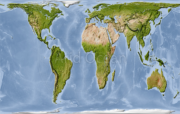
One remedy for Mercator’s polar inflation is a projection that prioritizes area. German historian Arno Peters invented one such “equalarea” projection in 1967 and presented it as a replacement for Mercator’s that would more accurately, and fairly, portray the developing world. This aspect made the Peters projection (above) popular with development organizations and educators in the 1980s. The projection made news in 2017 when the Boston Public School System began hanging it in classrooms in place of Mercator maps.
But cartographers, and many others, generally despise the Peters projection because it drastically distorts the shapes of continents, stretching them vertically near the Equator and squashing them horizontally near the poles. The Peters projection may not be pretty, but comparing it to Mercator’s is a cogent demonstration of how important the choice of projection can be.
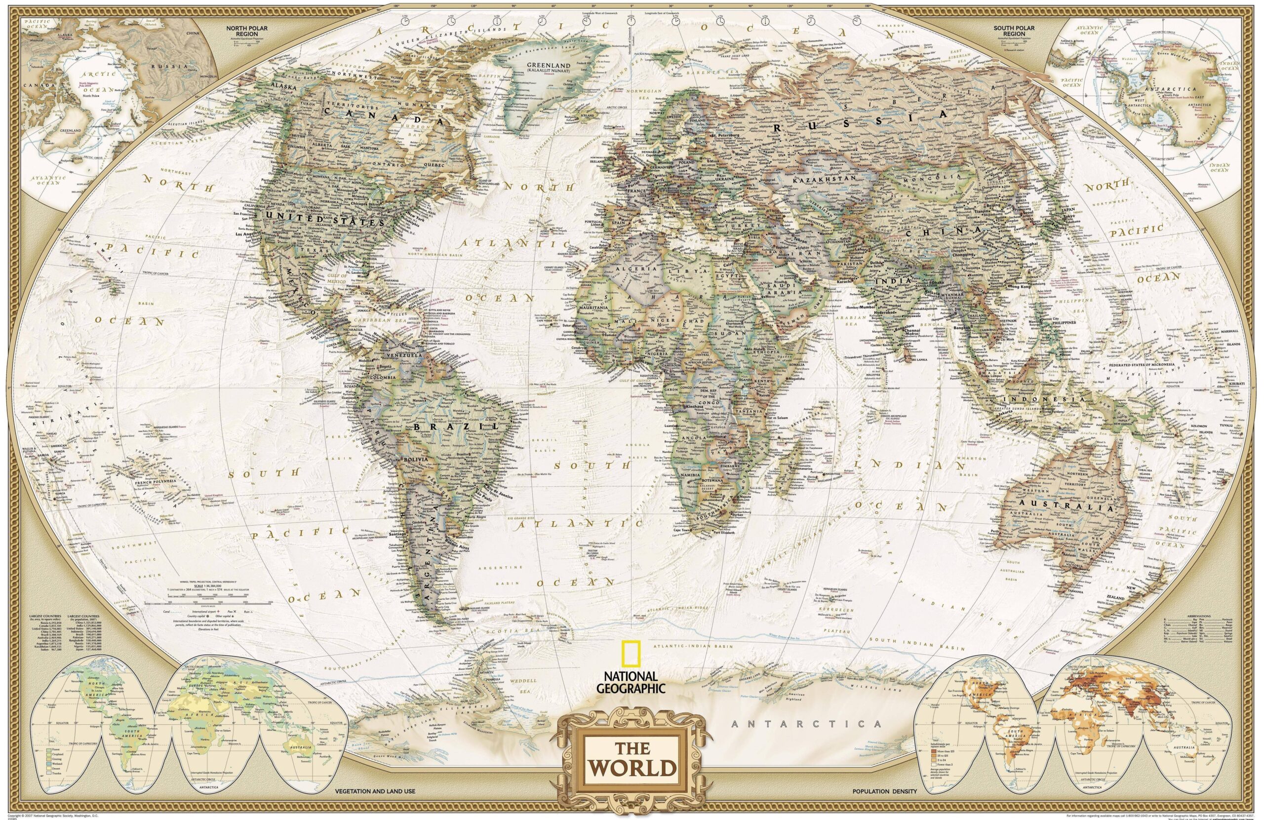
National Geographic’s preferred projection, known as the Winkel Tripel (right), is an example of a compromise projection. It minimizes distortion as much as possible by spreading it out among the various geographic factors in an effort to make everything look balanced and achieve an aesthetically appealing portrayal of the world.
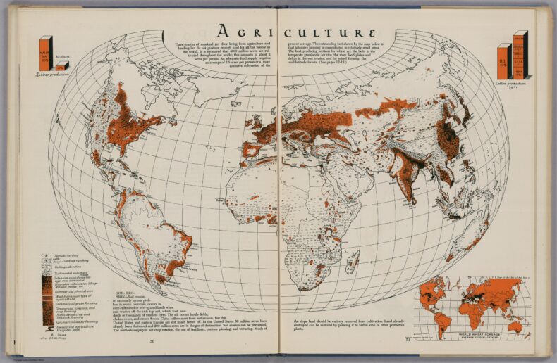
Another such compromise projection was created in 1943 by Hungarian American cartographer Erwin Raisz, a vocal critic of the Mercator projection. He called his projection the Armadillo for its resemblance to that animal’s curved, leathery armor. It adds an element of perspective that makes the projection appear three-dimensional, almost as if Earth had been cracked open and spread apart. “Although the distortions on the peripheries of the [projection] may be extreme, we perceive the correct proportions because we visualize a three-dimensional body instead of a flat map,” Raisz wrote in a paper introducing the projection. Though Raisz used the projection for a few thematic maps in his 1944 atlas (below), it was mostly intended to inspire experimentation with new projections.
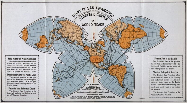
Another way to keep from warping the continents is to break the map into pieces. In 1909 Bernard Cahill, a British architect living in San Francisco, presented a projection made of eight triangles with curved sides arranged in a configuration resembling a butterfly (below). While this interrupted view breaks up the oceans, it minimizes the distortion of the continents. Cahill argued that his Butterfly was a much better map than Mercator’s “preposterous chart” for anyone interested in comparisons of things that occur on land: geographers, teachers, political economists, statesmen, students of the Weltpolitik, and especially scientists. “In short, the uses of such a map are endless,” he wrote. He formed the Cahill World Map Company to promote the projection, but the Butterfly never caught on.
Other interrupted views fared somewhat better. J. Paul Goode’s “orange-peel” projection, which could be arranged to divide the oceans and keep the continents whole or vice versa, was introduced in 1923 and used in Rand McNally’s Goode’s World Atlas through most of the rest of the 20th century. Two examples of Goode’s projection can be seen in the bottom corners of the National Geographic world map showing population density and vegetation and land use.
Perhaps the best known example of an interrupted view was invented by American architect and visionary Buckminster Fuller in 1943 and introduced with a photo essay in Life magazine. Fuller’s projection is made by first projecting the Earth’s surface onto a 20-sided shape made of triangles called an icosahedron. The map can then be unfolded in a number of ways, but he settled on this arrangement in 1954, which he named the Dymaxion map. It modifies a few of the triangles to show the proximity and connectedness of the planet’s landmass as “one island in one ocean.”
There are thousands of different solutions to the problem of flattening Earth’s surface. Each offers a different outlook on the world that is sometimes intentional, but often incidental. In a sense, every map starts with a lie, and viewers would do well to keep that in mind.
