Every Map Starts with a Lie

This map of the world published in 1961 by the U.S. Navy Hydrographic Office uses the Mercator projection. This projection distorts the shapes and relative sizes of the continents, enlarging them near the poles, but it preserves directions, making it useful for navigation at sea.

It’s not often that a map projection makes headlines. I have tried and failed to convince editors they are newsworthy. So it’s honestly exciting to see so many stories about the United Nations’ decision to adopt a new map projection. When I heard the news, I thought, “YES! They are ditching the Mercator. Good riddance!” I was pretty sure I knew why. 

To understand this decision, it helps to know a little about map projections. Because the Earth is a three-dimensional, round object, all maps have to distort geography in some way to fit that information onto a two-dimensional piece of paper (or your computer screen). Think of cutting open a tennis ball and trying to lay it flat on a table. There are five different aspects of geography that can be distorted to varying degrees during the flattening process: area, shape, distance, direction, and angle. Reducing the distortion of one of these attributes necessarily means increasing the distortion of one or more of the others. A map projection is basically math that dictates how things are distorted. Cartographers choose projections based on the purpose of a map.

 (More on map projections—including my favorite, the Armadillo — and how they work in an excerpt from my book All Over the Map below), 

The Mercator projection was designed for navigating oceans, so it prioritizes keeping angles and directions between two locations true. To make up for that, it distorts the size and shape of landmasses, making some places (notably Africa) look smaller relative to other continents, and it inflates the size of others (notably Europe and North America). People have argued that this also inflates the perceived importance of northern hemisphere countries relative to countries closer to the equator, which is what I suspected was the reason the U.N. ditched the projection.

From thetruesize.com

To see how absurd the Mercator projection’s distortions are, visit thetruesize.com where you can see that Brazil is essentially the same size as the entire continental U.S., and also the same size as Canada! Alaska is smaller than Libya. And yes, Greenland is not larger than South America (as it appears to be in the Mercator map at the top of the post). In fact, it is only a quarter of the size of Brazil alone. (You can read more about how your mental map of the world is probably wrong in this story I wrote for National Geographic). 

But my glee at hearing the news was immediately followed by dread. If you want the size of the landmasses to be relatively undistorted, but you still want a rectangular map that fits nicely onto a square piece of paper, the solution is even worse than the problem: the hideous Gall-Peters projection, which, as many cartographers have pointed out, makes the continents look like wet laundry hanging from a clothesline (see the first map in the excerpt below). 

Thankfully, the U.N.was willing to forgo the square in favor of a much more attractive choice: the Equal Earth Projection. This is a fairly new option, having only been invented by a trio of cartographers in 2018.

Another handy way to visualize the distortions of a map projection is Tissot’s indicatrix, which plots circles on the map that are stretched the way the underlying geography is. Here are the indicatraces for Mercator, Gall-Peters, and Equal Earth projections.

Tissot’s indicatrices

The following is an excerpt from my book with Greg Miller, All Over the Map: A Cartographic Odyssey (National Geographic, 2018).

Flattening the World

The problem of reducing the globe to two dimensions has many interesting solutions

Every cartographer creating a map of the world faces the same problem: how to flatten the skin of a three-dimensional sphere onto a two-dimensional plane. There’s simply no way to do it without stretching, tearing, or otherwise distorting the planet’s surface. Unless it’s on a globe, every map is an imperfect representation of reality in one way or another.

Different ways of representing Earth’s curved surface on a flat map are called projections. To choose one, cartographers have to decide which types of distortion they can live with and which to minimize. Projections can distort five aspects of geography: area, shape, distance, angle, and direction. Reducing one means increasing others.

One of the best known world map projections was designed in the 16th century by German-Flemish cartographer Gerard Mercator as a framework for maritime navigation. Maps that use his projection prioritize angles and direction so that if you were to draw a straight line between two points, you could measure the angle of the line with a protractor and use that bearing to travel between those points in the real world. Mercator’s projection remained popular into the 20th century, hanging on walls in many classrooms and, some would argue, distorting students’ conception of the world. It was particularly ubiquitous for maps focused on the oceans. The U.S. Navy Hydrographic Office adopted it (top of the post) and eventually pressured the U.S. Coast and Geodetic Survey into using it as well.

The Peters projection used for this shaded relief map of the world keeps the total area of the continents and oceans correct relative to each other, but shapes are distorted. The continents are stretched vertically near the equator and compressed horizontally near the poles.

The Mercator projection began to fall out of favor in the middle of the 20th century largely due to one of its other notable characteristics: In order to keep direction true, lines of longitude have to be parallel, which means area is increasingly inflated toward the poles. This leads to gross distortions of the relative size of continents and countries, with some absurd results. For example, Sweden appears to be twice its actual size. Europe is also larger than it should be, which was handy for cartographers trying to fit in all of Europe’s tiny countries and their names. But some argued that the projection is misleading because it magnifies the perceived importance of northern countries relative to those closer to the Equator.

One remedy for Mercator’s polar inflation is a projection that prioritizes area. German historian Arno Peters invented one such “equalarea” projection in 1967 and presented it as a replacement for Mercator’s that would more accurately, and fairly, portray the developing world. This aspect made the Peters projection (above) popular with development organizations and educators in the 1980s. The projection made news in 2017 when the Boston Public School System began hanging it in classrooms in place of Mercator maps.

But cartographers, and many others, generally despise the Peters projection because it drastically distorts the shapes of continents, stretching them vertically near the Equator and squashing them horizontally near the poles. The Peters projection may not be pretty, but comparing it to Mercator’s is a cogent demonstration of how important the choice of projection can be.

National Geographic uses the Winkel Tripel projection for its world maps. The projection is designed to minimize the distortion by spreading it out among all the geographical aspects. In its online store, National Geographic proclaims that on this 2015 map, “Greenland is shown the same size as Argentina and not as the size of all of South America.”

National Geographic’s preferred projection, known as the Winkel Tripel (right), is an example of a compromise projection. It minimizes distortion as much as possible by spreading it out among the various geographic factors in an effort to make everything look balanced and achieve an aesthetically appealing portrayal of the world.

Another such compromise projection was created in 1943 by Hungarian American cartographer Erwin Raisz, a vocal critic of the Mercator projection. He called his projection the Armadillo for its resemblance to that animal’s curved, leathery armor. It adds an element of perspective that makes the projection appear three-dimensional, almost as if Earth had been cracked open and spread apart. “Although the distortions on the peripheries of the [projection] may be extreme, we perceive the correct proportions because we visualize a three-dimensional body instead of a flat map,” Raisz wrote in a paper introducing the projection. Though Raisz used the projection for a few thematic maps in his 1944 atlas (below), it was mostly intended to inspire experimentation with new projections.

The Armadillo projection used for this map of world agriculture in Erwin Raisz’s 1944 Atlas of Global Geography is named for its resemblance to that animal’s armored skin. It adds a bit of three dimensional perspective while still showing most of the globe. New Zealand disappears around the corner, so on some Armadillo maps, a “pigtail” with the islands on it is added.

Another way to keep from warping the continents is to break the map into pieces. In 1909 Bernard Cahill, a British architect living in San Francisco, presented a projection made of eight triangles with curved sides arranged in a configuration resembling a butterfly (below). While this interrupted view breaks up the oceans, it minimizes the distortion of the continents. Cahill argued that his Butterfly was a much better map than Mercator’s “preposterous chart” for anyone interested in comparisons of things that occur on land: geographers, teachers, political economists, statesmen, students of the Weltpolitik, and especially scientists. “In short, the uses of such a map are endless,” he wrote. He formed the Cahill World Map Company to promote the projection, but the Butterfly never caught on.

This 1923 promotional map puts San Francisco at the center of the world using Cahill’s Butterfly projection. The projection minimizes distortion by breaking the globe into eight pieces that can be arranged in various ways to keep either continents or oceans intact. The note on the map was written by Cahill to an acquaintance and says, “My plan of the world. I will give $100 to you if you can show me a more accurate one as to form, area, distance, and direction.”

Other interrupted views fared somewhat better. J. Paul Goode’s “orange-peel” projection, which could be arranged to divide the oceans and keep the continents whole or vice versa, was introduced in 1923 and used in Rand McNally’s Goode’s World Atlas through most of the rest of the 20th century. Two examples of Goode’s projection can be seen in the bottom corners of the National Geographic world map showing population density and vegetation and land use.

Perhaps the best known example of an interrupted view was invented by American architect and visionary Buckminster Fuller in 1943 and introduced with a photo essay in Life magazine. Fuller’s projection is made by first projecting the Earth’s surface onto a 20-sided shape made of triangles called an icosahedron. The map can then be unfolded in a number of ways, but he settled on this arrangement in 1954, which he named the Dymaxion map. It modifies a few of the triangles to show the proximity and connectedness of the planet’s landmass as “one island in one ocean.”

There are thousands of different solutions to the problem of flattening Earth’s surface. Each offers a different outlook on the world that is sometimes intentional, but often incidental. In a sense, every map starts with a lie, and viewers would do well to keep that in mind.

A Little Night Music (Revisited)

Dueting with animals will always be thrilling for me, and I’ll always envision our melodic conversations filling a sound gap somewhere up there. Enjoy this memory along with me!

I had a conversation with an owl the other night. It was a barred owl, a pretty common species in the woods around our cabin in central Virginia. The bird got going early—well before dusk—and I happened to be outside with my native wooden flute (purchased from this lovely flutemaker in Canada), so I found similar notes and replied in the same pattern. There was a pause while cicadas and crickets took a turn. Then, the owl again. Four quick hoots, repeated twice, the final one dropping off into a guttural drag. I waited a few beats, lets the insects hum some more, then played again, the eight notes. Seconds passed. Then, the owl.

Barred owls aren’t just one-note birds: They have a variety of calls, more than a dozen by some counts, including one that you’d swear came from a monkey. But this was the one people like to say sounds like “Who cooks for you? Who cooks for you all?” (I’m not sold on that comparison, but it endures.)

It’s very possible, likely, even, that my flute playing had nothing to do with the owl’s decision to keep hooting. In my experience these owls will repeat the sequence at least a few times over a couple of minutes, regardless of any back talk. But I like to think we were conversing. There’s something magical about hearing a wild animal respond to you the way he would to his own kind, as if what you said was meaningful enough in his language to warrant a reply.

If barred owls weren’t so vocal, I wouldn’t know for sure they were around. Only once did I spy one, barely, as I pointed my flashlight beam into the big oak where a call seemed to be coming from. It was fully dark, but I glimpsed the bird’s eyeshine before he swooped toward me and then away, over my head. (A little anatomy: An owl’s eyes are super reflective, having an extra layer called the tapetum lucidum that snags light passing through the retina and bounces it back to what are already very sensitive rods.) The swoop was almost silent; I felt it more than heard it. Which is the owl’s way: The structure and texture of the wing feathers lets them funnel air very quietly by breaking up the turbulence that would otherwise whoosh.

But it was the calls moving through the air more than the bird’s anatomy that interested me that night. I thought about how the animal’s vocalizations in a sense fill a niche much as the physical animal does. It’s a more temporary residency, but still. I had the same notion some months before while lying in my tent in a rainforest in Borneo. I was listening, on my first night there, to the delightfully unfamiliar calls of wild things coming awake just before dawn. As cricket chirps were topped by a bird’s song that gave way to monkey chatter, I envisioned the soundscape in 3D with each unique noise—with its own pitch and volume and frequency—rushing in to inhabit an empty spot, standing tall to make itself known—ta da!–and then vacating just as quickly. Picture Tom Cruise in Minority Report flinging bits of data around in space with his finger…sliding this bit over, that one up, another one off screen, a new one in to replace it. That’s sort of how I saw it.

So, I think of animals as competing not just for a physical niche but for an aural one as well—a slot in the soundspace not yet taken that they can fill with chatter and alarms and music and be heard despite the din. It’s another way to make oneself known in a crowd. The variety makes it all possible: An elephant sending low-frequency rumbles through the Earth reaches her intended even as lions roar and cicadas scream. Like a lioness intent on spotting the weakest gazelle in the herd, an animal can hear a familiar voice and a known language rising above all others.

I don’t know that this is a terribly profound notion, but conversing with the owl, I realized that my flute toots were taking up one tiny pocket of aural space, filling that sound niche just for a moment, then flitting offscreen, leaving that spot vacant for the owl’s reply. Profound or no, it was kind of a neat way to think about it.

–Photo by Joshua J. Cotten on Unsplash

A baleful tale of the snails in Hayle

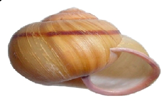
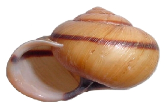
snails clustering at the top of a leafy plant looking like flowers

If you really squint at a map and spin up your full kindergarten imagination, Great Britain looks like a little cartoon dinosaur roaring at Europe, its tail pointing back across the Atlantic ocean. Zoom in on the tip of that squat tail: this is Cornwall, home of clotted cream and dramatic coastal walks.

a cartoon of the map of Great Britain looking like a dinosaur

Right at the end you’ll find a shaggy little town called Hayle. Hayle’s defining feature is an exceptionally enormous beach, but that’s also pretty much its only feature. That was exactly what we were after. For a few days this summer, we escaped the heat and crowd and stench of London for a settlement of little one-story hobbit houses pressed into the dunes. 

The path from our particular hobbit house to the beach wound along barely existent paths through dry, sharp grasses and brambles that nipped at our ankles and calves. I started to notice that some of these grasses bloomed with an intriguing flower I had never seen, whose pale white whorls looked almost snail-like. I examined them more closely.

Continue reading

Snapshot: The best bug, August edition

Black, brown, and green cicada on a brick step

I’ve said it before and I will say it again: There is a bug that is the best bug, and it is the cicada. We’ve just come out of August, the time of the dog-day cicadas – the ones that come out every year. This one was greeted me on my stoop the other day, as I arrived home after a dog walk.

The dog-day cicadas aren’t like the 17-year cicadas. Well, they are, in that they are also cicadas, and they are also adorable and perfect. The dog-day cicadas are black and green, much subtler than the 17-year cicadas’ wild red eyes and orange decorations. Unlike the 17-year cicadas, the dog-day cicadas arrive in reasonable numbers. And you don’t see them as often; they seem to have an instinct for self-preservation through secrecy, like a normal edible animal. A dog-day cicada has never mistaken my leg for a tree and climbed up it, looking for a mate.

But I do spot them occasionally, over the years. A day or two before this one, I saw two mating on the sidewalk. I ushered the pair over to a sheltered spot among some tree roots, although, linked butt to butt as they were, they looked enough like a poop that they probably weren’t going to get stepped on anyway. “Entomology!” declared a passerby, as I nudged them along and they buzzed wildly – they did not like being disturbed.

I looked at my doorstep cicada and worried about it getting squished later, if I thoughtlessly came back outside to water the oregano or something, so I grasped it firmly, a finger on either side of the thorax, and tossed it toward some plants. But it had bigger dreams; it extended the flight and took its leave by wing, away, past my parked car, into the distance, off to live its short cicada life.

Photo: Helen Fields, obviously

Songs of Home

And here we are enduring another wet blast of late summer’s hot breath, a last gasp before fall blows in. This imminent transition of seasons is always a thoughtful time for me, for many of us. Here’s how I was thinking about it a few years ago.

Squirrels are comforted by birds’ easy chit-chat, new research tells us. Biologists already knew the scurrying rodents tuned into birds’ alarm calls, but they didn’t realize that the mammals responded to songs about the good times, too. Content chirps suggest to squirrels that all is well. 

To me, too.

At this time of year especially I find that sounds tell a comforting story. Here at the edge of the woods, at my Virginia cabin, late summer stretches and layers the crickets’ songs and deepens the quiet. The breezes are still-warm, breathy farewells to August. Birds, less riotous at the feeder, are choosier with their calls but certainly not silent: While no longer desperate to mate, those that don’t migrate still have territory to claim.

Today a few singular voices are cutting through the crickets’ hum–though I’ll admit I confuse the bluejay’s and the red-shouldered hawk’s caws unless I hear them side by side. Somebody’s crisp piercing note rises above another’s cascading dribble. I don’t know who’s who; clearly, I need to work on my bird IDs. But September’s in progress, these voices tell me: Revel in this transitional world.

The ways smells tap into memory, the sounds of home, I find, go deep and loosen knots. 

We have one of those percolating coffee pots–this one handed down two generations now–that truly sputters, moans, and sighs. There is no better, kinder alarm. And the ceiling fan wobbles just a tad, calling attention to itself, promising with its slight rattle that warm days are still to come. (I like to say that winter is still just a whisper in another room.) 

At night, I am early to bed, he stays up late. I lie awake waiting for the whoosh through the pipes, the shower spray’s uneven battering of the tub floor as steam encircles tired shoulders. Then, the squeaky turning of knobs, the water’s silence, the rubbing of towel on skin. And soon, a distinct clack–the front-door lock engaging, thank goodness he remembered–then two snaps: bathroom goes dark, hallway goes dark. Ease. Another day has closed. Tomorrow might be grayer, cooler, the light at a new angle. That’s okay.

And the finale: The dog paws at the blankets at my feet, claws raking against fabric; he circles once, twice, then flops down, waits a beat, and exhales fully. That sigh settles my heartbeat every time.

Fall, of course, will bring its own music—the zip of jackets, the crunch of leaves underfoot, the crackle of fire. These are cliches, perhaps, but powerful just the same.

But this anteroom to fall–as birds settle down (to squirrels’ relief) and the first crumpled leaves meet now-brittle grass (you can hear them land if you really listen)–has its own subtle sounds, those of a dog-tired season beginning to let go.


Birds by Annatsach –  (Wikimedia commons)

Tree by Charles Patrick Ewing (Wikimedia commons)

Fear of Mountain Lions

This post came out a few years ago exploring anxiety and big, wild cats. At that point, there had been no deaths this century from mountain lions in Colorado where I live. New Year’s Day this year that statistic changed when a woman was attacked while alone on a hiking trail not far from the town of Estes Park. Forensics pointed to asphyxiation, meaning the lion had her throat in its jaws and closed off her airway.

Statistically, one should worry far more about cows than mountain lions. Annually, domestic cows in the US kill ten to twenty people — trampled, gored, or by vehicle collisions — while around thirty human deaths have been recorded from mountain lions since widescale recording began in the 1880s. Chances of being killed by a cat in the Americas is negligible, but clearly it’s not zero. Is it worth freaking out?

My wife pieced together a kill in our driveway, sending me pictures of deer tracks posed in a casual walk followed by a sprawl, deer fur in the snow, and faint signs of melt, a couple hours old at most. The next picture was of cat tracks the size of an adult human palm, a good sized mountain lion dragging the deer. A path like that of a saucer sled was left down the drive where the mountain lion gripped the deer’s throat in its teeth and pulled it a couple hundred feet to the canyon’s edge below our house. My wife took pictures and video all the way, and where it hauled the body over the snowy rimrock, her text said she stopped following it. If she were with me she might, but alone no way.

Later, we laid together in bed in the flicker-light of a fire and she recounted finding fresh tracks and studying the kill pattern. The deer, she said, were coming through together, a line of them, no sign of scatter before the attack, so it was swift, not a chase. The kill, she said, struck her as quick, quiet, dutiful, and done.

It happened right behind the house, between the firewood and solar panels, which gives a person pause going out for wood or clearing snow from the panels. We see plenty of cat tracks around here, benches of rimrock in a high desert piñon-juniper biome, perfect place for travel and ambush. In winter they follow deer like sharks trailing a shoal. When deer tracks are around, there will be mountain lions. The rest of the time, snow is mostly blank.

Lately, we’ve been seeing lots of deer tracks and a fresher mountain lion moving through. I go out for wood not afraid so much as aware. I don’t often worry about being attacked. When deer and elk populations dwindle in mountain lion terrain, they tend go down in size, targeting porcupines and house cats. Attacks on humans are rare. Where we live, deer and elk are plenty and lion health is generally good, making a physical confrontation with humans less likely. Bad encounters tend to come from starving or curious juveniles or elders barely holding onto their teeth, not a cat that takes down a full-grown mule deer in a single pounce.

Continue reading

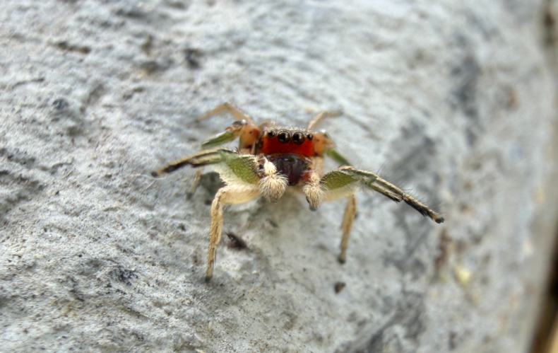
Are Jumping Spiders Capable of Innovation?

Betsy Mason

Innovation is one of those abilities we used to think only humans possessed. But you’ve probably heard about the creative problem solving of New Caledonian crows who are able to build tools by bedding wires to fish food out of holes. Captive orcas have been observed chewing up the dead fish they are fed and spitting them onto the surface of their pools to attract gulls that they then prey on. And elephants are known to pile logs onto electric fences to create a safe crossing.

Most animals that are widely considered capable of innovation are mammals and birds, and scientists point to three things these these species have that are likely prerequisites for this ability: big brains, long lifespans, and complex social lives. 

Spiders, on the other hand, are tiny, short-lived, and mostly solitary. They seem like unlikely innovators, but a new study suggests we may have underestimated spiders’ cognitive capabilities. Again.

Continue reading

Baltimore in August

Baltimore in August: I was out on my early-morning walk, I don’t even know the temperature or humidity or feels-like combination, I’ve given up caring but all numbers were high, and I ran into a neighbor going the same way so we walked together for a bit. We were neither one of us built for physical movement in this weather and we were both panting. Neighbor, lying through his teeth: Nice that it’s getting cooler out every day. Me, also lying: Summer’s winding down. You do what you must to get through it. I’m apparently running this post every August because, as I said, given up — August 17, 2022; August 23, 2024; August 20, 2025; and todaybecause as I also said, you do what you must to get through it.

I have nothing good to say about Baltimore in August. Ok, the farmers’ market is moving into high season, peaches & tomatoes, also okra — that’s good. Digression: I spent childhood on a small farm in the midwest making internal proclamations and declarations about freezing corn and canning applesauce in a hot kitchen, like, if I ever get outa here I’m never doing this again, not me. Until decades later, I ran into the irrevocable fact that peaches and tomatoes have a few-weeks’ season and the rest of the year aren’t worth eating, so now I’m freezing peach crisp and tomato sauce and apologizing to the sweaty irritated young Ann. Anyway, I think that’s it for anything good about Baltimore in August.

The sun is out, temperatures are in the 90s and dew points are in the 70s, dew points being the temperature at which water condenses out of the air so that was 20 degrees ago — meaning that gills would have been the better evolutionary option here because the air is 52.76% water. At these dew points, the air is holding all the water it can so you can’t cool by sweating; these dew points, says our beloved Capital Weather Gang, are not just oppressive but offensive and “very gross.” Digression: I asked a neighbor who was a public health scientist just back from equatorial Africa what it was like there and she said, “About like here.”

Nights might get down to the upper 70s, same dew points; another neighbor had a friend visiting from California ask when the evening would cool off, and the neighbor just snorted. Digression: once I asked my gyn when I was going to stop having hot flashes and she too just snorted. So anyhow, that’s the Baltimore days and nights.

The afternoons, however, are terrifying, due to a hair-raising alliance between physics and chemistry. More heat means more action in the air and less density, meaning as we all know, that hot air rises. More water — for chemistry reasons having to do with molecular weight that I don’t understand — also means less density, also rising.

So whooop, up she goes, wet hot air, rising rising, juicing up the atmosphere, and the more juice, the more convective instability — digression: I read that phrase first as “collective instability” which, yes, we are, aren’t we — which is measured as CAPE, Convective Available Potential Energy, the operative words being “potential energy.” Because that wet hot air rises up into the high atmosphere where it’s cooler, then condenses and carries all that juicy potential energy into thunderheads which grow crazy big, bigger every minute, blooming over the city like an alien invasion.

And inside those thunderheads, all the molecules and things get charged and the electric fields get more intense and the energy that’s been potential now just lets loose, the fields discharge and become lightning, also in a way I don’t understand but neither do scientists. Lightning heats the air to 55,000 degrees until the air explodes into thunder, and the closer in time the lightning is to the thunder, the more it seems personal. Digression: a neighbor and I were on his porch, the neighbor holding his cat, and a simultaneous lightning/thunder hit, CRACK BAM, and the cat exploded like thunder out of my neighbor’s hands, and the rest of my life I’ll remember that cat, feet outstretched, hanging like a bat in the air above us.

Anyway, afternoons in Baltimore: watchful anxiety, the thunderheads get bigger, the chances of storms go up and up until finally and with some probability all hell breaks loose, physics and chemistry unconstrained by human convenience.

Windows rattle, transformers blow up, trees crash down, the power goes out — recently for days — and so does the AC, and you sit there in the dark in a puddle of your own sweat if you can even sweat. Streets flood, and the Capital Weather Gang repeatedly posts TURN AROUND DON’T DROWN; flights are delayed, then cancelled, then you can’t get home until the afternoon of next Thursday when thunderstorms will again be likely — these weather patterns are stable — and flights will be cancelled again.

The best you can say about Baltimore is that it’s not in the midwest where cells of convection become supercells and your house gets blown into the next county. So I guess that’s a second good thing about August in Baltimore — catastrophes here, as with so much else, are not sensational; here we have Armageddons but they’re unassuming.

_________

Chuck Patch via Flickr Creative Commons: Baltimore’s Artscape, when it’s so routinely hot and/or rainy, it’s called Artscape weather.
Yianni Mathioudakis
, also Flickr Creative Commons: also Baltimore