Lest you think that only old books can be bothered to note the fonts in which they’re printed, the latest (Sep., 2025) Thursday Murder Club’s opening pages say it’s set in Adobe Jenson Pro, which has been designed by Cassandra Garruzzo Mueller, bless her.
And in the spirit of font-noting if not the letter, J.L. Carr’s splendid books open with an ode to the printing office, “the Crossroads of Civilization, Refuge of all the Arts against the Ravages of Time. From this place Words may fly abroad not to perish as Waves of Sound but fix’d in Time, not corrupted by the Hurrying Hand but verified in Proof. Friend, you are on Safe Ground. This is a Printing Office.”
I think what they’re all getting at is, after some public person wrote this book and some less visible person edited it, some completely invisible person put together the physical book. This latter person did the book carefully and lovingly, and here presents it to you, and hopes you like it.
This first ran December 13, 2019.
You finish the book, you don’t want it to be over with, there’s still one more printed page, so you read it. “A Note on the Type,” it says, and heads off into the highest weeds: the name of the font in which the book is printed, then the font’s forebears, its continuing history, its inventor, its inventor’s history, and sometimes its virtues. This is blindingly irrelevant, unsatisfying, and irritating, and so on purpose I never read it.
Until the book I just finished, Imogen Gower’s The Mermaid and Mrs. Hancock, when I hit the “Note on the Type” page and kept on reading:
This book is set in Caslon, a typeface named after Willliam Caslon (1692-1766).
Aaaand it just goes on from there, the better part of a page. The voice was slightly prissy and assumed I wanted to know a great deal about the William Caslon and his adventures in, as it said, “typefounding.” Caslon founded a family of typefounders but before that, he was apprenticed to an engraver of gunlocks (and of course gun barrels too) in London, then opened his own shop for silver chasing. I don’t know the meanings of: typefounding, gunlock, silver chasing, and a part I left out, bookbinders’ stamps. Caslon’s skill in cutting letters – I don’t know what that is either – attracted two printers whose names I’ll furnish if you need me to and who backed him to buy typefounding equipment. The fonts Caslon cut for a folio edition of John Selden – of whom I’ve never heard – “excited great interest” and thereafter Caslon just went from strength to strength. His font has many virtues, each ennumerated, and its “general effect is clear and open but not weak or delicate.”
WHY is this interesting? WHY? And who thinks I want to know? And who in the name of the sweet baby Jesus writes these things?

I google, I read Wikipedia on typeface: roman is regular and italic is italic, and they’re called that because Italy is somehow involved here? The names of the fonts are a delight and a seduction (see link) but typeface and font are not quite the same thing and oh God oh God a thick fogbank moves over my brain, I can read no farther.
Peter Ackroyd’s Casebook of Victor Frankenstein, 2008: set in Legacy Serif, created by Ronald Arnholm, inspired by Venetian Old Style fonts by Nicolas Jensen, initially designed to imitate the handwriting of Italian Renaissance scholars but “still serves their function well today.”
I don’t know what “old style” fonts are either, but maybe that Italian Renaissance handwriting is why fonts are roman or italic? Sure, why not.
Back to “Note On the Type”: apparently that page is a kind of colophon, a sort of “this is my name and I wrote this” at the ends of ancient manuscripts which with the invention of printing became, for instance, “this is who printed this book and when,” though Wikipedia notes that sometimes colophons were images and sometimes even curses and I am not, not, not going to look that up. No.
George Saunders, Lincoln in the Bardo, 2017: set in Fournier, named for Pierre-Simon Fournier, youngest son of a French printing family, said to have created and cut 147 alphabets, best known as the designer of St. Augustine Ordinaire.
Googling turns out to be no help – one of those deals where the answer is probably buried in the back room of an article about something distantly related and I’m already forgetting the question.
Hermione Lee, Penelope Fitzgerald, 2012: set in Adobe Garamond, based on types first cut by Claude Garamond (c. 1480-1561), who was a pupil of Geoffroy Tory and who created the “old style” types which have “a certain elegance and feeling of movement.”
I’m not going to look up “old style,” I don’t care, it’ll just have to content itself with being peripheral to my life. Part of the answer to the question of WTF these pages are can be pulled from the pages themselves, which by the way are not boilerplate, they’re written specially and even their titles are different. The original inventors of typefaces seem to be French, English, Dutch, or Italian, specifically Venetian. Their types were modified, improved on, subtracted from, added to. Typefaces were invented with, of course, the invention of printing — though that can’t be quite true, those medieval scribes did some pretty fancy fonts. Anyway, that’s about it.
Julian Barnes, The Sense of an Ending, 2011: set in a version of Monotype face Bembo, cut by Francesco Griffo and first used in Pietro Cardinal Bembo’s De Aetna of 1495. The companion italic is an adaptation of chancery script type designed by Lodivico degli Arringhi [which I thought was Italian for “herring” but turns out to be “harangue.”]
I’ll stop wandering around pointing out rabbit holes now. I still don’t know why these pages are written, why what started as a colophon is still being done – don’t historical artifacts die out on their own? I don’t know who writes them – the printer, maybe? And what about a given type conveys a “feeling of movement,” or an effect that is “not weak or delicate?”
But I’m morally certain, with no evidence whatever, that somewhere on the internet is a devoted band of typefounders who can explain every nuance of these “Note on the Type” pages. I might regret this, but I hope they write in.
_______
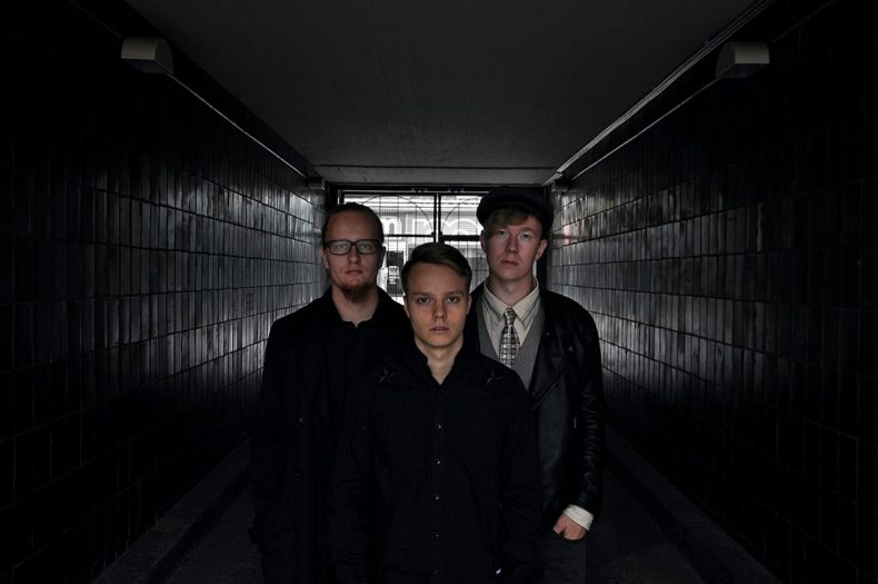
Photos: I’m pretty sure this is one of the devoted bands of typefounders and if it’s not, it should be, by Juuso Järvi ; the brilliant Periodic Table of Typefaces is by Jeremiah easter , via Wikimedia Commons, here if you want to blow it up. You’d be able to see the inventors and year of invention.
______
Commenters on the original post say, among other things:
“Regarding typeface, there is a charming show about a designer on Netflix. The show is: Abstract: the art of design. The episode is: Jonathan Hoefler: typeface. His wonder and excitement is a joy to watch.”
“Someone wrote a whole book about your rabbit hole! Mr. Penumbra’s 24 Hour Bookstore, by Robin Sloan. It’s from 2012 so a bit too sanguine about tech but the adventure bit is brilliant.”
“For those of us who are really into it, reading “a note on the type” is like watching a behind-the-scenes featurette or listening to the director’s commentary on a movie: certainly not essential, but having someone who’s really good at their craft explain their process will never be boring. I don’t expect everyone to read Simon Garfield’s “Just My Type” (https://www.simongarfield.com/books/just-my-type-us-edition/). But type is just as varied and can be just as expressive as color, and learning to use it well is a powerful skill for visual communication.”

Note on the Type
Ann Finkbeiner, A Note on the Type: WTF, 2019: set in Alegreya designed by Juan Pablo del Peral for Huerta Tipográfica.
Alegreya was chosen as one of 53 “Fonts of the Decade” at the ATypI Letter2 competition in September 2011, and one of the top 14 text type systems. It was also selected in the 2nd Bienal Iberoamericana de Diseño, competition held in Madrid in 2010.
Alegreya is a typeface originally intended for literature. Among its crowning characteristics, it conveys a dynamic and varied rhythm which facilitates the reading of long texts. Also, it provides freshness to the page while referring to the calligraphic letter, not as a literal interpretation, but rather in a contemporary typographic language. … Not only does Alegreya provide great performance, but also achieves a strong and harmonious text by means of elements designed in an atmosphere of diversity.
—-
(smile) I think you forgot this. (source: https://fonts.google.com/specimen/Alegreya/about)
You’re right I absolutely forgot that and what a thing to forget! Thank you very much.